Artist in Oils


January 2016


Click on this picture to view thumbnails
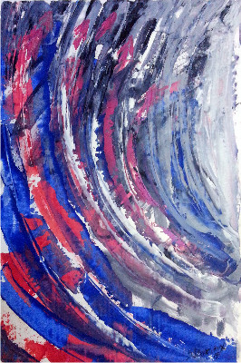
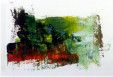
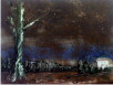
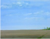
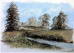
The majority of these pictures are painted with a palette knife and colour shades are mixed on the canvas. Only the paint left over from a formal painting is used in these quick creations except for "Paynes Grey" as I prefer not to use black in any of my paintings. I have yet to see pure black in nature and if I have to create one this would be a mixture of Paynes Grey and Sap Green.
The colours used from this palette are:- Cobalt Blue, Flake White, Burnt Umber, Titanium White, Primary Cadmium Yellow, Sap Green and Iridescent blue/red made by Pebeo. Having experimented with colour in the printing industry for nearly 30 years, I look at my oil paints the same way. The industry standard "Pantone" system colour charts are essential for creating tones of a base for print, and as oil paints are nearly pure in colour - I always think and see "Pantone". After experimenting with Iridescent oil paint I found that a hint mixed into a skin tone enables me to create 10-20 shades of that tone. Trial and error - I never give up!
The colours used from this palette are:- Cobalt Blue, Flake White, Burnt Umber, Titanium White, Primary Cadmium Yellow, Sap Green and Iridescent blue/red made by Pebeo. Having experimented with colour in the printing industry for nearly 30 years, I look at my oil paints the same way. The industry standard "Pantone" system colour charts are essential for creating tones of a base for print, and as oil paints are nearly pure in colour - I always think and see "Pantone". After experimenting with Iridescent oil paint I found that a hint mixed into a skin tone enables me to create 10-20 shades of that tone. Trial and error - I never give up!
"Impressionism is my relaxation
from formal portraits"
Stuart Devereux
from formal portraits"
Stuart Devereux
Copyright © 2016 Stuart Devereux.

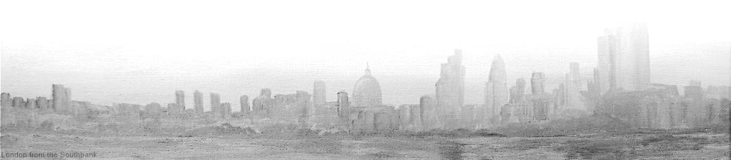
From "The Palette" Knife Paintings using the left over paint.